

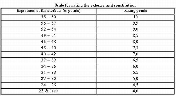
Tables
- Properties: precise, good for large amounts of data, and geared toward the readers drawing their own conclusions.
- Types: number tables (may or may not arrange data by a particular point you want to make) and word tables (good for comparing simple concepts).
- Principles: Keep "independent elements" (e.g. names of cities) in the leftmost column, dependent variables in their own columns. Group rows into fours or fives if your table has many rows. Always interpret the data in your paper.
- Properties: general (vs. precise), good for comparing smaller amounts of data, and may imply a story, depending on how you arrange the variables.
- Types: bar charts (avoid 3-D, elaborate, and divided-bar charts - if you use the latter, provide an accurate key for each variable), pie charts (good only for very simple comparisons), and volume charts in general (e.g. a 3-D barrel divided into sections).
- Alternative: a point chart.
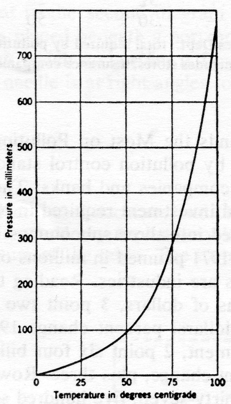
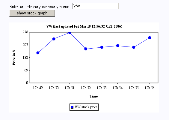
- Properties: imprecise, good for showing "rough relationships among many points" - remember that readers will extrapolate off either end.
- Types: point, connected-line, connected-point, and area graphs.
- Think of all the possible ways you could arrange the data you present with a graph, stacked (area) ones in particular. By switching the order of variables or adjusting the scale (e.g. cutting off the lower 50% of a graph) you can dramatically alter the initial impression of trends in data.
- This will be discussed in more detail in the "Ethics" section, tomorrow.
No comments:
Post a Comment